15 B2B Landing Page Examples That Convert (With Principles That Make Them Work)

The best B2B landing page examples share three traits that most marketers overlook: they lead with credibility before asking for contact details, they target one outcome per page, and they write headlines that focus on the buyer’s problem rather than the vendor’s product. B2B buyers evaluate multiple vendors simultaneously, carry complex internal approval requirements, and distrust friction-heavy forms. The examples in this guide break down what each page does right, the specific conversion principles at work, and how to apply the same thinking to your own pages.
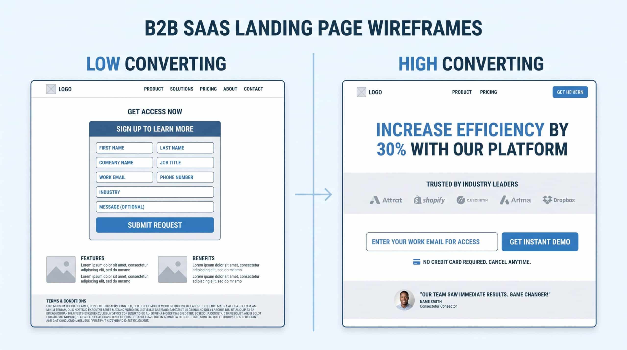
B2B landing page examples: high-converting layout vs low-converting layout comparison

Quick Answer: What Are the Best B2B Landing Page Examples?

The highest-converting B2B landing pages in 2026 use click-through models for high-value services, place social proof adjacent to the form, limit form fields to five or fewer, and open with headlines that name the buyer’s problem. Top performers hit double-digit conversion rates; the median SaaS landing page converts at 3.8%. The examples below span SaaS, consulting, technology, finance, and professional services, with conversion principles applied to each.

Why B2B Landing Pages Are Different From B2C

B2B landing pages operate under constraints that B2C marketers rarely face. The sales cycle is longer. Multiple stakeholders are involved in purchase decisions. The buyer is often a professional evaluating three to five competing solutions simultaneously. And the cost of a wrong choice is high enough that decision-makers default to caution rather than action.

These constraints create specific requirements for B2B landing page design that differ from B2C best practices in four key ways.

B2B vs B2C Landing Page Differences: B2B pages need to establish authority before asking for commitment, because trust is the primary conversion variable. They need shorter forms, because B2B buyers will abandon longer forms at higher rates than consumer audiences. They need outcome-driven headlines (not feature-driven), because B2B decision-makers evaluate tools based on business impact. And they need social proof that is specific to the buyer’s industry, because peer validation from relevant companies carries far more weight than generic testimonials.

B2B Landing Page Conversion Benchmarks for 2026

Before reviewing the examples, grounding the analysis in current data helps distinguish a good landing page from a merely adequate one.

  • The median SaaS landing page converts at 3.8%
  • Top-performing B2B pages reach 10% or higher
  • Pages with five or fewer form fields convert significantly better than longer forms
  • Mobile traffic accounts for 40%+ of B2B research sessions, even for enterprise products
  • Click-through page models consistently outperform direct lead-gen forms for high-value B2B services

These figures come from Unbounce’s Conversion Benchmark Report, which tracks conversion data across thousands of B2B campaigns. WordStream’s landing page research further shows that the top 25% of landing pages convert at 5.31% or higher, underscoring the gap between median and top performance.
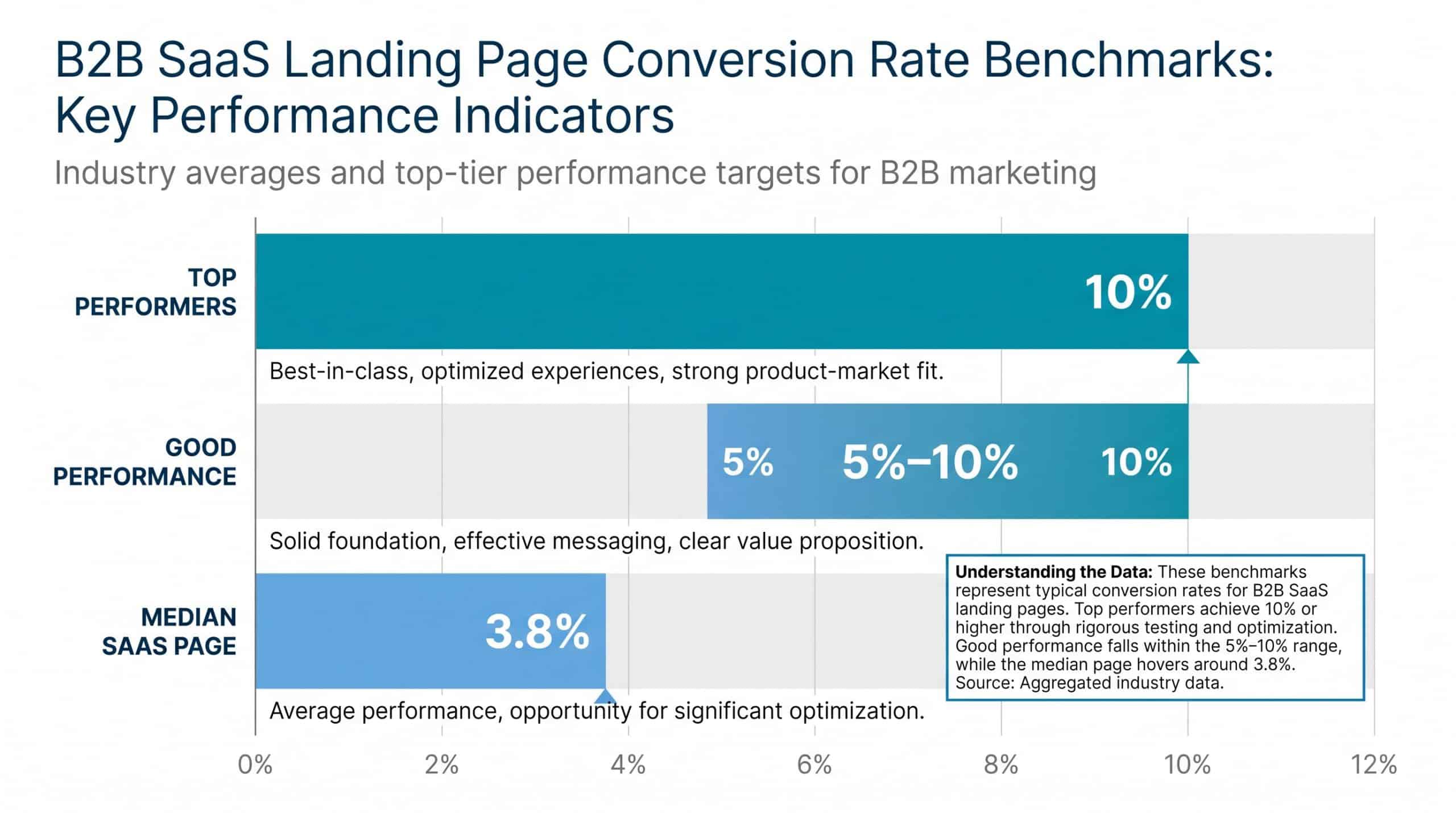
B2B landing page conversion rate benchmarks showing 3.8% median SaaS conversion rate

These benchmarks matter because they define what “high-converting” means in B2B. A 5% conversion rate is exceptional for an enterprise SaaS landing page targeting VP-level buyers. A 5% rate for a low-cost SMB tool would suggest significant room for improvement.

15 B2B Landing Page Examples That Drive Conversions

1. HubSpot: The Authority Play

This B2B landing page example from HubSpot’s CRM demonstrates one of the most studied principles in B2B conversion: authority first, form second. Every HubSpot landing page leads with recognizable customer logos from Fortune 500 companies before the visitor encounters any form field. The headline focuses on a specific business outcome (“Grow better with HubSpot”) rather than a product feature. The form itself asks for minimal information at the initial conversion point, with progressive data collection handled through subsequent interactions.

Conversion principle at work: Social proof from recognizable companies reduces perceived risk, which is the primary objection B2B buyers have before sharing contact details. When a decision-maker sees that competitors or aspirational companies use the same tool, it activates peer validation before they’ve read a single feature description.

2. Salesforce: Outcome-Led Headlines

Salesforce B2B landing page examples consistently open with a problem statement, not a product statement. Rather than leading with “Salesforce CRM,” their acquisition pages open with the buyer’s situation: “Sell smarter. Close faster.” This distinction matters more than most marketers realize. When the headline names a business outcome the buyer already wants, it signals that the page understands the buyer’s context, which keeps the visitor reading rather than bouncing to compare options.

Salesforce also uses a tiered trust architecture. Customer logos appear first. Case study metrics (“40% increase in revenue from existing customers”) appear second. Product features appear last. This sequence mirrors the actual decision process a B2B buyer uses: trust first, proof of outcome second, product evaluation third.

3. Slack: Minimal Form, Maximum Conversion

Among the most studied B2B landing page examples, Slack’s acquisition pages demonstrate how form length directly affects conversion rate. The primary landing page for new business signups asks for a single field: a work email address. That’s it. No company name. No team size. No job title. No phone number. The entire first conversion step is to capture an email address, with all qualification occurring through the onboarding sequence rather than the landing page form.

This approach removes the primary source of friction at the moment of highest intent. A visitor who has decided they want to try Slack has to make exactly one decision: whether to share their email. Every additional form field creates an additional decision and an additional opportunity to abandon the page.

How Many Form Fields Do B2B Landing Pages Need? The data consistently show that B2B landing pages with five or fewer form fields outperform those with more. For SaaS free-trial pages, a single email field yields the highest conversion rate. For high-value B2B services where lead qualification matters (consulting, enterprise software), four to five fields capturing name, email, company, and company size provide enough data to prioritize follow-up without creating friction that would cause qualified leads to drop off.

Guide showing optimal B2B landing page form field count with 5 or fewer fields performing best

4. Drift (Now Salesloft) : The Conversational Model

Drift pioneered the conversational landing page model in B2B: instead of a static form, the page features a chat widget that initiates a qualification conversation as soon as a visitor lands. This approach works because it replaces form friction with something that feels more natural to B2B buyers who are used to talking through purchasing decisions rather than filling out paperwork.

The Drift model is particularly effective for high-value B2B products, where the sales cycle already involves a discovery call. By starting the conversation on the landing page, it reduces the steps between first visit and first sales interaction from five (form fill, email confirmation, calendar link, booking confirmation, call) to two (chat initiation, transfer to sales).

5. Mailchimp: Problem-First Positioning

Mailchimp’s SMB-targeted landing pages show how problem-first positioning works at scale. Their headline sequences consistently identify the buyer’s situation before introducing the solution. “Your business needs email marketing that works” identifies the context. “Mailchimp gives you the tools” delivers the solution. “Join 13 million businesses” provides the social proof. This three-step sequence compresses the essential conversion logic of a full-length landing page into the above-the-fold section.

6. Asana: The Progress Visualization Technique

Asana’s B2B landing pages use a technique few competitors have adopted: they show the before-and-after of using the product without requiring the visitor to read more than a few words. A single animated or static graphic that shows a disorganized project view transitioning to an organized Asana board communicates the value proposition faster than any amount of feature copy. B2B buyers evaluating project management tools can immediately map their own situation to what they see on the page.

7. Shopify Plus: The Enterprise-Specific Page

Shopify Plus demonstrates why enterprise B2B buyers need separate landing pages from SMB buyers, even when the core product is similar. The Shopify Plus landing page uses different language, different examples, different social proof, and a different form than the standard Shopify acquisition page. Where the standard page emphasizes ease of use and quick setup, the Plus page emphasizes scale, dedicated support, and migration from legacy systems.

This segmentation principle applies across all B2B categories. A single landing page cannot simultaneously speak to the concerns of a five-person startup and a 500-person enterprise. The moments of hesitation, the decision criteria, and the relevant social proof differ. Separate pages for separate buyer segments consistently outperform consolidated pages that try to serve multiple audiences.

8. Zoom: The Frictionless Free Tier

Zoom’s B2B landing page examples show how free-tier offers change the landing page architecture. Because the initial conversion goal is free account signup rather than paid conversion, Zoom can ask for less information upfront and rely on product experience to handle the upgrade conversion. The landing page focuses entirely on removing barriers to the free trial signup, with paid features mentioned but not emphasized at the initial acquisition stage.

The lesson for B2B marketers is that the conversion goal determines the page design. A page converting for a free trial needs different architecture than a page converting for a demo request, which needs different architecture than a page converting for a paid subscription.

9. Intercom: The ROI-Led Approach

Intercom’s B2B landing page examples demonstrate a conversion approach that the research consistently validates: leading with ROI data before social proof. Rather than starting with customer logos, Intercom pages open with specific financial outcomes: “Increase conversion by X%” or “Reduce support costs by Y.” These claims are substantiated by customer case studies accessible through the page, but the ROI figure appears in the hero section before the visitor has to scroll or click.

This approach works because B2B buyers have to justify purchases internally. A decision-maker who can see the ROI case on the landing page has the core of their internal business case assembled before they submit a demo request. This makes the conversion decision easier because the work of justifying the purchase to a manager has been started for them.

10. Gong: Revenue Intelligence Positioning

Gong’s B2B landing page examples show how a new category creates its own conversion requirements. Gong created “revenue intelligence” as a category, which meant that their landing pages needed to simultaneously educate buyers about the category and convert them. This dual requirement led to a page structure that spends more space on the problem definition than most B2B pages would: explaining why traditional sales tracking is insufficient before presenting Gong as the solution.

For B2B companies building or occupying a new category, this “educate before convert” structure is often the most effective approach, even if it runs counter to conventional landing page wisdom about keeping copy short.

11. Clearbit (Now Breeze by HubSpot): The Data-Led Headline

Clearbit’s acquisition pages show how data-led positioning works in B2B. Instead of generic benefit statements, the page opens with a specific capability: “Know your buyer before they fill out a form.” This headline works because it names a specific capability that the target buyer (marketing operations professionals) already wants. There is no need for an explanation of why this is valuable. The buyer understands immediately.

The implication for B2B landing page design is that pages targeting sophisticated buyers (who understand their problem well) can use more specific, technical language in headlines than pages targeting buyers who are still defining their problem.

12. DocuSign: The Compliance-Forward Approach

DocuSign’s B2B landing page examples demonstrate how to convert in compliance-sensitive categories. For enterprise buyers in legal, finance, or healthcare, compliance signals (SOC 2 certification, GDPR compliance, encryption standards) need to appear early in the page because compliance risk is a primary evaluation criterion. DocuSign places these signals in the hero section and repeats them near the form, addressing the objection most likely to block conversion before it can fully take shape.

What Should B2B Landing Pages Include? A high-converting B2B landing page needs a problem-focused headline, social proof from relevant companies or individuals, a clear and specific call-to-action that names what happens next, form fields limited to what’s needed for follow-up, and an answer to the most common objection specific to the category. For compliance-sensitive industries, certifications and security standards should appear above the fold. For high-value services, case study metrics should appear adjacent to the form.

13. Salesflare: The Question-and-Answer Architecture

Salesflare’s landing pages use a less common but highly effective conversion architecture: they answer the most common questions visitors have before those visitors think to ask them. Rather than standard FAQ sections placed at the bottom of the page, Salesflare integrates question-and-answer blocks throughout the page at the exact points where the corresponding objections typically arise.

When the page describes a free trial, the objection “what happens after the trial ends?” is answered immediately. When the page describes CRM features, the objection “will this replace my current spreadsheet system?” is addressed in the next paragraph. This proactive objection handling keeps the visitor in a mode of evaluating the product rather than questioning whether to continue reading.

14. Pipedrive: The Pipeline Visualization

Pipedrive’s B2B landing pages built their initial growth around a single visual: a drag-and-drop pipeline view that immediately communicated what the product did and how it felt to use it. This “show, don’t tell” approach is particularly effective for sales tools, project management software, and any B2B product where the interface is itself the value proposition.

The Pipedrive approach demonstrates that product screenshots or demo GIFs placed prominently on a landing page can reduce the time a buyer needs to evaluate the product fit. A buyer who can see themselves using the tool on the landing page is much closer to converting than a buyer who has only read about what the tool does.

15. Typeform: The Multi-Step Form Model

Typeform’s B2B landing page examples demonstrate the conversion principle their product is built around: breaking a long form into a conversational sequence increases completion rates. By presenting one question at a time rather than displaying all fields simultaneously, the page reduces the cognitive burden of form completion. The visitor makes one small commitment at a time rather than one large commitment that encompasses all fields.

This model works particularly well for B2B landing pages where qualification data is important for sales follow-up but asking for all of it at once creates excessive friction. A four-step form asking one question per step typically outperforms a four-field form that displays everything simultaneously.

The Three Principles That Separate High-Converting B2B Landing Pages

Studying these B2B landing page examples reveals three principles that consistently appear in B2B landing pages that convert at rates above the median.

Authority Before Conversion

B2B buyers need to see credentials, case studies, and social proof before they will share contact details. The sequence matters. Pages that place the form or primary CTA before establishing trust consistently underperform pages that establish authority first. This is especially true for high-value services where the purchase decision involves multiple stakeholders and carries significant business risk.

The most effective form of B2B social proof is a specific, quantified outcome from a company the target buyer recognizes or aspires to be like. “40% increase in pipeline conversion for HubSpot customers” is more persuasive than “customers love us.” “Trusted by 100,000+ businesses” is less persuasive than a logo bar featuring recognizable brands in the target buyer’s industry.

One Goal Per Page

Every high-performing B2B landing page in this analysis has one primary conversion goal, and every element on the page serves that goal. Pages with multiple CTAs, multiple offers, or multiple conversion paths consistently convert at lower rates than pages with a single focus. This single-goal principle applies even when multiple audiences might visit the page. The correct solution for multiple audiences is multiple pages, not a single page with multiple paths.

Reduce Cognitive Load

B2B offerings are complex. A B2B CRM serves dozens of use cases, integrates with hundreds of tools, and varies in implementation based on team size and industry. A B2B landing page cannot and should not try to communicate all of this. The highest-converting pages ruthlessly prioritize what the target buyer needs to know to make the initial conversion decision, leaving everything else for the post-conversion experience.

Progressive disclosure techniques, accordion tabs for secondary information, and clean visual hierarchy all reduce cognitive load. These design choices trade comprehensiveness for conversion, which is the correct trade-off for a page whose goal is to generate a lead or start a trial, not to serve as a product encyclopedia.

How to Apply These B2B Landing Page Examples to Your Own Pages

The value of studying B2B landing page examples is not in copying the visual design but in understanding the conversion principles that make each page work. Here is a structured approach to applying those principles.

Step 1: Audit your current page against the authority-first principle. Does your page establish credibility before asking for contact details? If your form or primary CTA appears before your first piece of social proof, reorder the page.

Step 2: Count your form fields. If you have more than five, identify which fields are truly necessary for the initial conversion and move the rest to post-conversion qualification. Remove any field that exists for internal reasons rather than to qualify the lead for sales follow-up.

Step 3: Evaluate your headline against the outcome test. Does your headline name an outcome the buyer wants, or does it name a product feature or company claim? If the headline reads as a product description, rewrite it to start from the buyer’s problem.

Step 4: Identify your primary objection. What is the most common reason a qualified buyer fails to convert on your landing page? Build a direct answer to that objection into the page at the point where the objection typically arises, not in a FAQ section at the bottom.

Step 5: Choose the right page model. For high-value B2B services (consulting, enterprise software, professional services), use a click-through model that builds the case before presenting the conversion action. For lower-commitment offers (free trials, self-serve software), a direct lead-gen form at the top of the page is appropriate.

If your B2B content strategy needs a sharper focus on attracting and converting the right leads, Sproutworth’s B2B content marketing services help funded startups build content that converts at the account level, not just at the click level.

Frequently Asked Questions About B2B Landing Pages

What is the average conversion rate for a B2B landing page?

The median B2B SaaS landing page converts at 3.8%. Top-performing B2B landing pages reach 10% or higher. The conversion rate varies significantly by offer type, traffic source, and industry. Pages converting for a free trial typically outperform pages converting for a demo request. Paid search traffic typically converts at higher rates than organic search traffic because the intent is more clearly defined at the moment of the search.

How many form fields should a B2B landing page have?

Five or fewer form fields for most B2B landing pages. For free trial or newsletter signups, a single email field delivers the highest conversion rate. For demos or consultations where sales follow-up requires qualification data, four to five fields covering name, work email, company, and company size provide enough information without creating excessive friction. Avoid asking for phone numbers unless the sales process requires immediate outbound follow-up, as phone number fields reduce form completion rates for most B2B audiences.

What makes a B2B landing page different from a B2C landing page?

B2B landing pages require more trust-building before the conversion action because purchase decisions involve multiple stakeholders and carry higher business risk than typical consumer purchases. B2B pages benefit from industry-specific social proof, compliance signals for regulated industries, and outcome-led headlines that address business impact rather than personal benefit. B2B buyers are also more likely to be evaluating competing solutions simultaneously, which means the page needs to differentiate as well as convert.

Should a B2B landing page use a click-through model or a lead-gen form?

For high-value B2B services where trust and credibility are the primary drivers of conversion, click-through models consistently outperform direct lead-gen forms. The click-through model lets the page build a complete case before the visitor encounters a form, which reduces form abandonment. For lower-commitment B2B offers (free trial, self-serve SaaS, content download), a direct lead-gen form at or near the top of the page is appropriate. The right model depends on the offer value and the buyer’s decision complexity.

How long should a B2B landing page be?

The correct length for a B2B landing page depends on the complexity of the purchase decision, not a word count target. Simple offers with low decision complexity (free software trial, newsletter signup) can convert effectively on a short page with a hero section and a form. Complex offers that require the buyer to build an internal business case (e.g., enterprise software, consulting services) typically require longer pages that address the buying committee’s concerns, provide case study evidence, and handle the most common objections. The page should be as long as necessary to handle the buyer’s objections, and no longer.

Using B2B Landing Page Examples to Improve Your Own Conversions

The B2B landing page examples that consistently convert above the 3.8% median share a set of principles that are visible once you know what to look for: authority before conversion, one goal per page, and cognitive load management through progressive disclosure and clean visual hierarchy. The specific visual execution varies. The underlying principles do not.

The most useful exercise after studying these examples is to audit your own landing pages against the three principles above, then prioritize the changes that address the biggest gap between your current page and what the evidence shows works. A page that leads with social proof before the form, reduces form fields to five or fewer, and opens with a headline that names the buyer’s problem is already in the top half of B2B landing page performance. The optimization work after that is refinement, not reconstruction.

If your B2B content needs to do more conversion work, Sproutworth works with seed-to-Series C B2B tech companies to build content that attracts qualified buyers and converts them into pipeline, not just traffic.

Author

  • Dhruv Maheshwari

    Dhruv Maheshwari is a freelance content marketer who helps SaaS and online businesses boost their online presence. In his free time, he is chiseling his fitness-goals and traveling around the world.

    View all posts