
Web design directly impacts on-site user behavior. Beautifully designed pages inspire brand trust. They elevate purchase intention. And they even increase customer loyalty. However, the simple truth is that none of these outcomes would be possible without a proper engagement strategy.
Given that the average bounce rate exceeds 60% and web visitors spend just over 90 seconds on a website before moving on, it’s clear that your primary web design goal should be to grab and retain visitor attention.
However, encouraging web visitors to explore your site and consider investing in your products or services necessitates a thorough understanding of what your prospects want, need, and expect from an interaction with your brand. To encourage user engagement and site exploration, it is essential to understand how design facilitates or discourages website interactions.
The good news is that you can achieve impressive engagement rates by implementing a few tried-and-tested tactics to elevate audience interaction. The following are some of the best smart web design strategies to drive user engagement and site exploration, along with examples of brands that utilize them effectively.
Enable Product-Level Inventory Exploration
Convenience is one of the most valuable elements of a conversion-inspiring browsing experience. In fact, it’s one of the primary things consumers demand, with 77% of people saying that they base their purchase decisions on speed, accessibility, and availability. Even more, they’re willing to pay a 5% premium if it means having a more convenient shopping experience.
To elevate engagement rates and boost site exploration, consider making shopping with your brand more convenient for your target audience. This is particularly important if you have an extensive inventory, as visitors can easily get lost in the sea of products.
Example: Sewing Parts Online
Sewing Parts Online is a prime example of a brand with a vast inventory, going the extra mile to help its users find what they need. If you look at its homepage, you’ll see that this brand effectively uses web design to enable convenient site exploration. Pay close attention to the search function just below the header section.
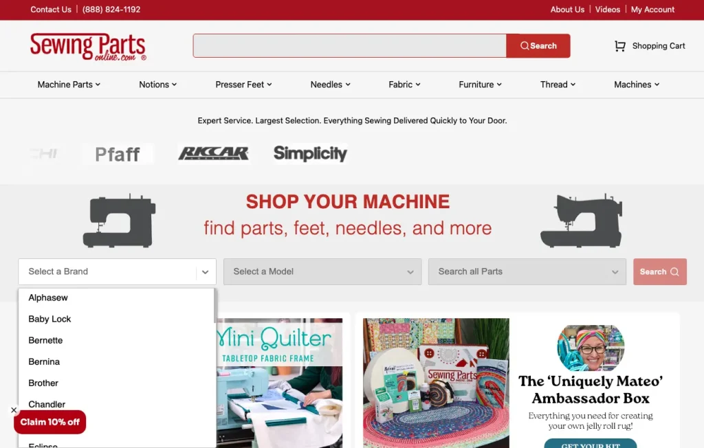
Knowing that the process of finding the right spare part among tens of thousands of options can be frustrating, this brand’s search feature encourages web visitors to narrow down their criteria as much as possible. The outcome is a much faster method of finding the exact product shoppers need to resolve their pain points. More importantly, this type of approach prevents web visitors from becoming overwhelmed and abandoning their purchases altogether because the shopping process requires too much of their time and energy.
Of course, this engagement-boosting web design strategy isn’t strictly for brands with extensive inventories. It can work just as well in niche industries or when wanting to prevent web visitors from having to sift through irrelevant products before finding the right solution for their needs.
Example: Twigs Paper
The Twigs navigation menu is an elegant UX design strategy that works fantastically because it allows shoppers to shop by type or occasion. It makes it easier for consumers to find the perfect greeting card for their needs without having to browse through dozens of irrelevant options.

Design Smart and Intuitive Product Filtering on Category Pages
While we’re on the topic of easing product discovery — especially in situations where web visitors need to browse a ton of options before finding the right choice for them — it’s crucial to address how extensive choice affects purchase intent.
According to scientific research, a variety of options doesn’t necessarily lead to elevated conversion rates. In fact, in some settings, too much choice actually harms purchase intent due to the effect of decision fatigue.
So, if you’re looking for ways to drive user engagement and encourage site exploration, consider methods of making product discovery slightly less intimidating in information-heavy settings.
Example: SohoMod
One effective website design strategy that could help you accomplish this is to add smart and intuitive filtering options to category pages, like SohoMod did in the example below.
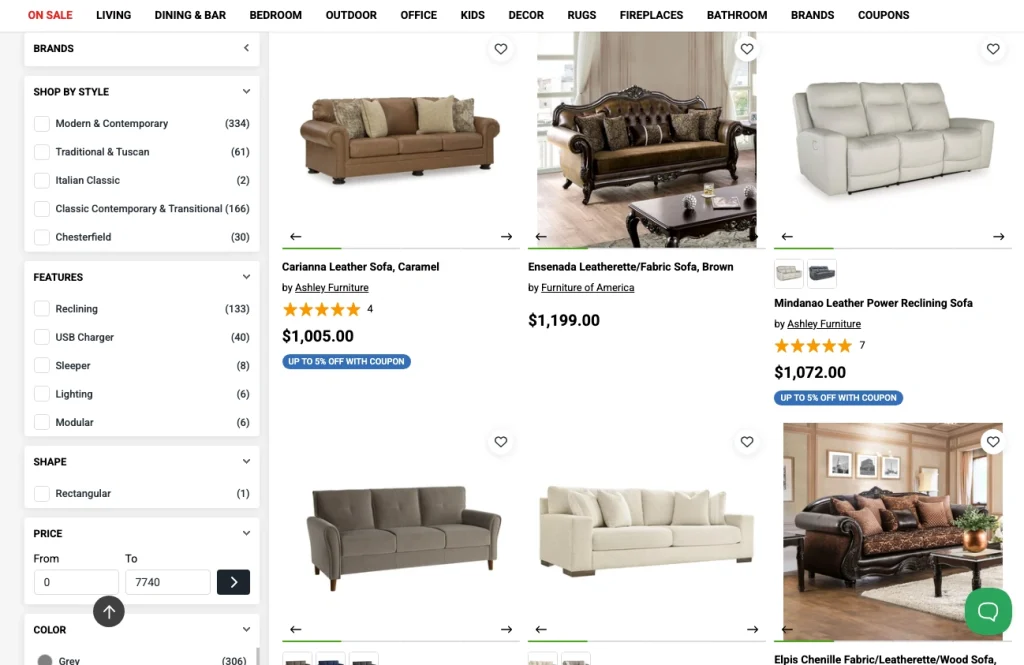
Instead of forcing web visitors to browse through hundreds of products until they find the right one for their needs, this brand uses filters to help shoppers discover products that meet their criteria. These filters don’t just pertain to brands and styles. They also allow shoppers to find products based on shape, features, color, price, material, and even availability.
Attach Exploration and Engagement to Meaningful Interactivity
Interactive web content elevates engagement rates by more than 50%.
But the truth is that including interactive content on your site won’t automatically drive product exploration. To accomplish that goal, ensure that interactivity delivers meaningful value to web visitors searching for solutions.
To drive user engagement and help prospects discover solutions that remove their pain points, make interactive web content relevant throughout the buyer’s journey.
Example: RapidDirect
RapidDirect does this beautifully with the prototyping element on its homepage.

This brand understands that its target audience has one primary goal: finding high-quality prototypes and sample parts that match their needs. That’s why it aligns its interactive feature with two desired outcomes. The first is a quick pricing quote, which is crucial for any consumer making a purchase (particularly for business buyers whom RapidDirect targets). The second is a free DFM analysis, which helps potential customers choose the best manufacturing tactic for their needs, ensuring ease, speed, and cost-effectiveness.
Example #2: Blume
A slightly more traditional example of a web design strategy that uses interactivity to engage visitors and guide them through the buyer’s journey comes from Blume.
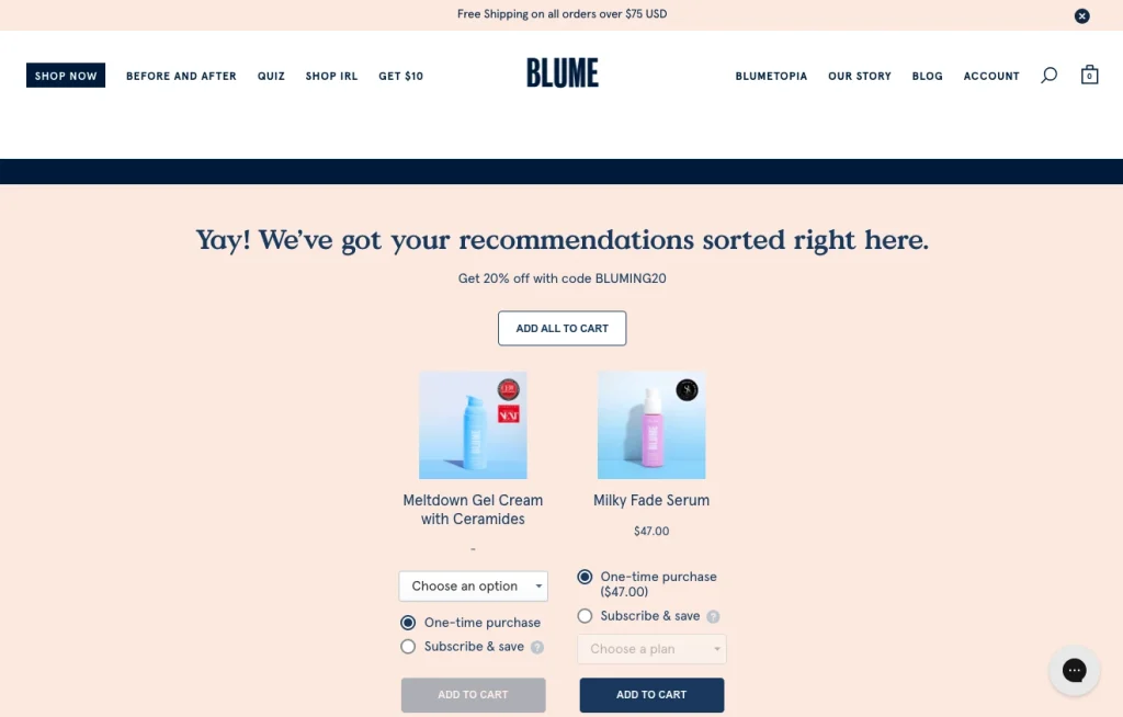
This brand sells a wide variety of products, each with a highly specific application. To ease product discovery and prevent the paradox of choice, the company encourages shoppers to complete a Skin Quiz. This interactive element gently guides potential customers through the product discovery process. Moreover, it presents them with relevant product recommendations, which is one of the best ways to shorten the sales cycle and elevate conversion rates.
Ensure Your Value Prop and Selling Points are Relatable and Meaningful
In 2025, consumers are through with irrelevant marketing messages.
According to research, 81% of shoppers ignore value propositions that don’t align with their needs and preferences. And 96% are likely to shop with brands that utilize personalization techniques.
If you look at the data on what consumers want from brands, these findings shouldn’t come as much of a surprise. It is well-known that 88% of shoppers find brand experiences to be just as important as product quality. Moreover, 73% of people expect companies to have a strong understanding of their unique needs and expectations.
So, when aiming to elevate user engagement and encourage site exploration, ensure your value proposition and selling points are relatable and meaningful to your target audience. Don’t beat around the bush. Instead, say exactly how you can help prospects remove pain points with sales messages that align with their expectations.
Example: Re Cost Seg
The RE Cost Seg homepage is an excellent example of how this web design tactic can make a potential client want to learn more about your brand and solution.
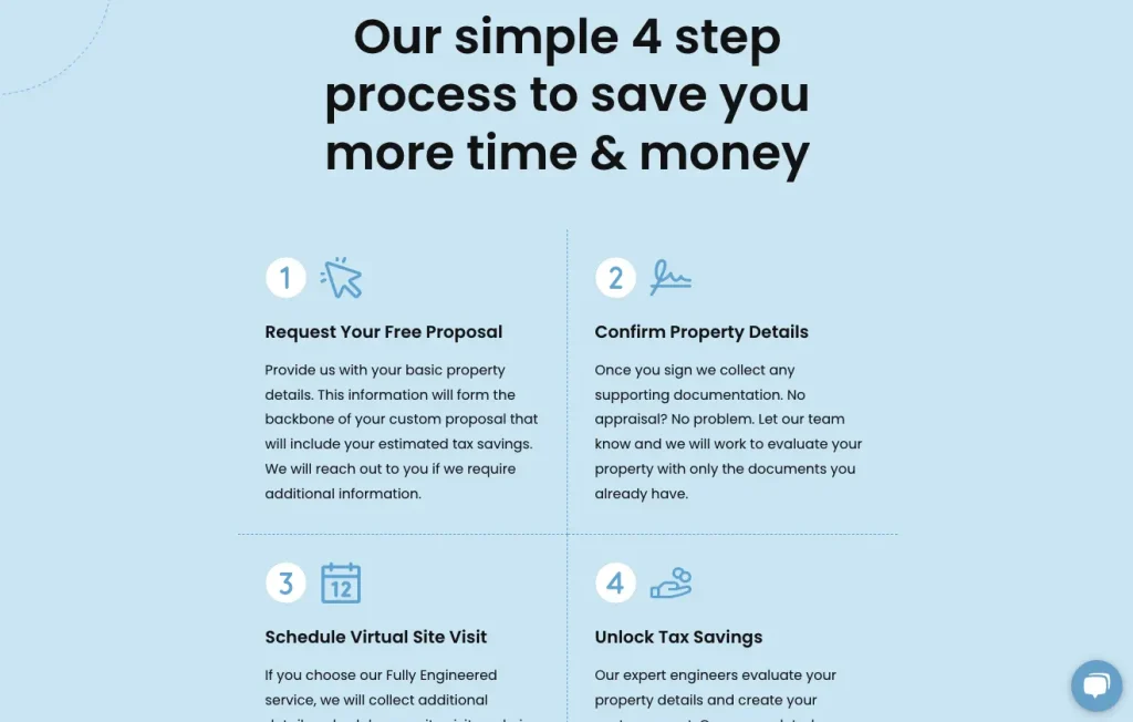
At first glance, you’ll see that this brand leads with a highly relevant value proposition, promising to help customers lower taxes and increase cash flow. Furthermore, it points out that it has helped clients save $600M+ on taxes. But what’s most important about ReCostSeg’s engagement strategy is that it makes its service really easy to understand — despite its complexity. It uses simple copy and visuals to break down the process into four steps, making it exceptionally easy for any web visitor to recognize the value ReCostSeg offers and instantly elevating prospects’ willingness to continue exploring the site.
Example #2: Cowboy
Another excellent example of a brand that presents audiences with highly engaging, meaningful value propositions comes from Cowboy.

Understanding that its ideal customers expect innovative product experiences and reliable quality, this brand uses interactive content to communicate its value propositions. By explaining sought-after product features through simple copy and in-app screen recordings, Cowboy ensures web visitors fully comprehend the benefits of investing in one of its bikes. Moreover, the brand effectively removes shoppers’ conversion obstacles, ensuring a higher engagement rate and an elevated chance of web visitors seeking out a test drive opportunity in real life.
Recognize the Importance of Content in Product Exploration
Convenience may be one of the primary drivers of online shopping (as opposed to in-store purchases). However, it’s essential to note that many consumers don’t necessarily go online to find a product to buy. Instead, they’re simply searching for information on how to remove their pain points.
So, are you looking to engage potential customers and encourage them to explore your site? In that case, you’ll want to create mechanisms to capture their attention and raise their awareness of the potential benefits of your solutions.
One of the most effective ways to accomplish this is by investing in highly relevant and SEO-optimized informational content.
Example: OrthoBracing
Take a look at how OrthoBracing uses its blog to engage web visitors.
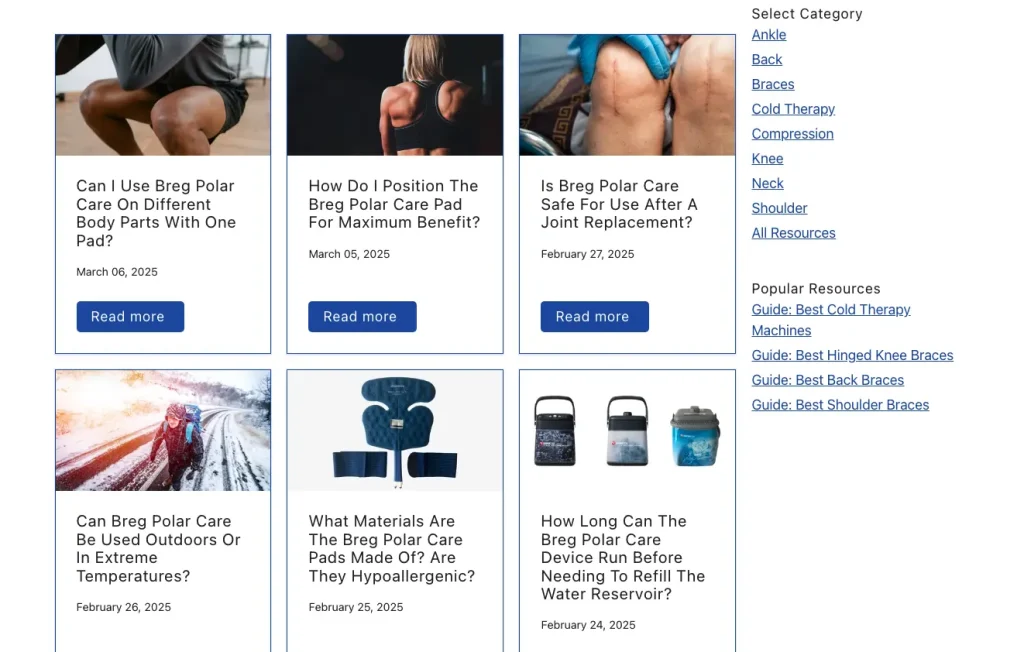
Knowing that it sells niche solutions, OrthoBracing had to find a way to link its offer to audience pain points despite a low level of product understanding. So, the brand took into consideration the fact that 62.8% of people use the internet to find information.
By optimizing each of its articles to answer common questions, OrthoBracing found a way to link each of its products to several use scenarios.
The outcome of this approach isn’t just a heightened level of user interest in its niche solutions. The elevated engagement rates also result in a higher time on site, with people arriving looking for an answer and staying to learn more about the various recovery solutions that might fit their needs.
Understand the Role that CTAs Play in Engagement and Exploration
On-site user behavior tends to be predictive.
People spend more time engaging with content above the fold. They consume content in several pre-determined patterns. They prefer to skim for relevant information rather than read word-for-word. And they often gravitate towards visuals.
It’s not surprising that aligning your website design with your visitors’ common behaviors ensures higher engagement and conversion rates. However, if you’re seeking tactics to boost engagement and drive specific on-site activity, it’s crucial to consider the role of CTAs in site interactions and exploration.
Essentially, calls to action provide not only visual and contextual cues but also tell web visitors what they should (or could) do next. Additionally, they encourage engagement and exploration by providing web users with an attractive next step in their buying/educational journey, whether by inviting them to explore products, consume content, or check out relevant social proof.
Even more importantly, when framed right — in a way that’s not overtly sales-oriented — CTAs can get visitors more invested in your offer without alienating them with aggressive conversion-oriented language.
Example: Start in Wyoming
Discover how Start in Wyoming leverages CTAs to boost on-site engagement.
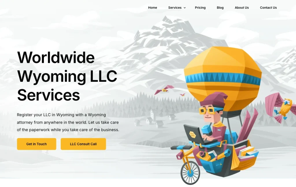
Knowing that information and service understanding are crucial to its target audience, this brand entirely avoids conversion-oriented language. Instead, it frames each CTA in a way that removes risk. So, web visitors don’t perceive phrases like “get in touch” or “LLC consult call” as the beginning of a sales pitch. Instead, these actions are a continuation of exploring the brand’s offer and are a user-friendly way for potential customers to learn more about what Start in Wyoming does.
You can find similar applications of this engagement-boosting tactic in e-commerce, particularly in the supplements industry.
Example: Optimum Nutrition
If you look at the Optimum Nutrition homepage, you’ll notice it includes a CTA inviting visitors to calculate their daily protein intake.
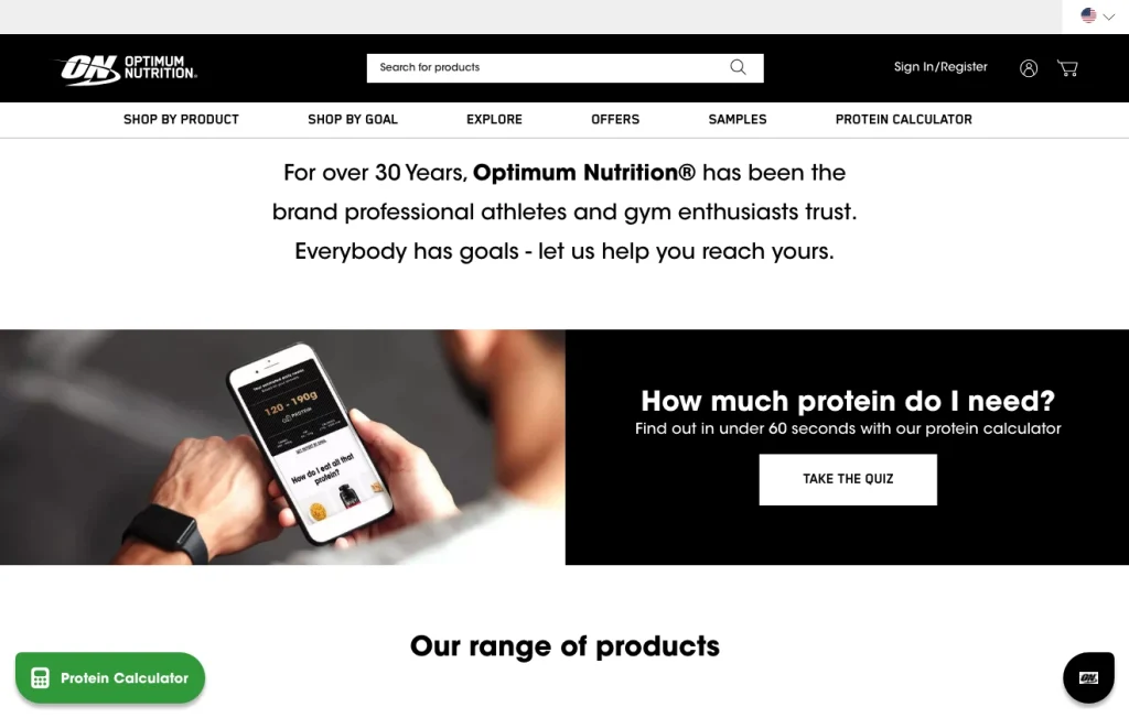
The approach works marvelously as it provides users with an attention-grabbing visual cue of what they should do next. It points out that the quiz only takes 60 seconds. And even though it doesn’t seem like a sales pitch, the results actually present visitors with several product suggestions, encouraging them to explore the brand’s solutions and consider converting.
Showcase the Emotional and Abstract Aspects of Your Product
Creating engagement (and buy-in) is not always a matter of presenting web visitors with informational value.
Yes, when choosing what products or services to buy, people do consider the cold, hard facts. But the truth is that they also make buying decisions based on their subconscious emotions.
So, if you’re looking for effective design tactics that will boost on-site engagement and encourage people to explore your offer, consider highlighting the emotional and abstract aspects of your product in a way that will result in stronger customer-brand relationships.
Example: Ever After Weddings
Take a look at how Ever After Weddings captures emotional resonance and invites exploration on their Videographer page.
On the surface, this is a wedding planning service. But what makes the brand stand out is its ability to speak directly to the emotional core of its audience. Rather than focusing on logistical details, Ever After Weddings frames its offering around atmosphere, feeling, and the once-in-a-lifetime nature of the experience.

From the poetic tone of the homepage copy to the cinematic photography and fluid site navigation, every design element is curated to evoke longing, romance, and trust.
By placing emotional storytelling at the center of the user experience, the website encourages visitors to feel what working with Ever After might be like. This elevates engagement and gently guides their leads to explore packages, real wedding stories, and planning tools.
This example is a strong reminder that people don’t just buy services, they invest in what those services mean to them.
Attach Products to Shopper Goals and Objectives
Lastly, as you explore tactics to boost engagement rates and encourage web visitors to explore your products, it’s a good idea to align your solutions with their goals and objectives.
After all, people often shop based on their goals. And about 37% of consumers fall into the ‘aspirational shopper’ category.
The best thing about this design strategy is that you can implement it in a few effective ways. Let’s explore those strategies using real-world examples.
Example: Oru Kayak
If you know that your audience’s buying decisions are goal-oriented, then you could take inspiration from Oru Kayak.

This brand includes a section on its homepage that encourages web visitors to pick their desired outcomes. By getting shoppers to opt for categories like ‘relaxing adventures,’ ‘bigger adventures, or ‘fishing adventures,’ Oru ensures that visitors are only presented with product suggestions that align with their goals, maximizing their chances of taking a closer look at one of the products.
Example #2: Dropbox
Alternatively, you could do something similar to Dropbox.

This SaaS brand employs a similar engagement-boosting tactic by stating who each pricing plan is for. So, by saying that an option is for personal use while others are for professionals, teams, or companies, Dropbox encourages people to recognize themselves (or their aspirational selves) in one of the options. Once that’s achieved — the web visitor identifies as someone who needs a professional or standard plan — they’re much more likely to do further research into the benefits of Dropbox’s solution and engage with the brand in a way that can lead to a conversion.
Final Thoughts
Engaging web visitors and encouraging them to explore your products isn’t rocket science. All it takes is a few smart website design tactics that are tailored to your target audience and empower them to reach their goals.
Of course, if you’re looking to skyrocket your engagement rates, don’t stop at just implementing the tactics we talked about. Instead, do your best to analyze site performance and explore ways to tailor these tactics to your brand’s (and prospects’) unique needs. That way, you’ll not only get more people invested in your offer but also gain a deeper understanding of their needs. You’ll also maximize your chances of positioning your brand as the best option for them.