Do you know these precise web design secrets that increase sales and sign ups?
Sure, keeping functionality, streamlining navigation and content as well as ensuring great usability can make achieving a well designed website hard to achieve. However website designs that improve customer’s experiences do impact the bottom line positively. In fact some would argue that design is king over content when potential customers come to your website for the first time.
Web Design Secrets That Increases Sign Ups and Sales
In this article I’ll look at some proven strategies to design and build websites that customers will keep coming back to use, sign up and buy from.
1. Value Proposition
Do you want customers to know why they should buy from you and why you are different and better, then, you need a value proposition.
The problem for most businesses is that they have a hard time deciding on their value proposition and communicating it clearly to their audience.
A value proposition quite simply is communicating “why you should buy from us to your customers”. This does not have to be just a headline or slogan but can take various forms including images or videos for example. Communication of this proposition should be visible and affect the entire site and customer experience.
Behavioural research shows that people pay attention to specific facts when they relate to desired benefit.
So how to you create a magnetic value proposition? Peep Laja explains, that the following are what you should address:
- Keep it simple and clear, so that it can be understood in 5 secs
- Be relevant to your potential customers by stating the problem that will be solved or how it will improve their current circumstances.
- Focus on the point of difference from that of your competitors
- Quantify value for your potential customers through benefits of purchase or sign up.
2. Keep It Simple
You have probably visited a site that had a whole bunch of unnecessary information on it and or made it hard to find the bits of information you were looking for.
The website shown below made the list of one of the worst websites made

So ensure you have relevant information clearly and easily accessible to your audience. Apply the KISS principle to avoid clutter, unnecessary navigation and to ensure simplicity to the overall design. Keep a customer’s perspective in the design of your site, keep it easy on the eye and ensure ease of use.
3. Colors For Conversion
One of the trickiest things to do when engaging in web design is to come up with a good color combination that can be applied well. There is no real consensus on the topic. However what is agreed on is that the use of color has more to do with context of the page itself.
Von Restorff a psychiatrist, discovered that whatever object stands out on the page is more likely to be recognized and easily remembered. This came to be known as the Von Restorff effect.
So in terms of application, a Studiopress article explains how to create a visual hierarchy for your site.

Source: Studiopress
As part of the hierarchy you can assign an action color to let viewers know where and when to click on important links and buttons.
4. Make a Headline
Data from EyetrackIII also backs research by David Ogilvy in that headlines are consistently the most viewed items on a webpage. Why?
Because people want to know exactly what the webpage is about and need to qualify if its what they want to spend more time on. So use bold, concise headlines to give your customers the information they need up front.
Take a look at the headlines used on the Shopify homepage below.

5. Leverage White Space
The use of white space is vital for ease of reading comprehension and scan ability. Research from Eyettrack III, Susan Weinschenk’s book Neuro Web Design and a study by Wichita state University all support the use of white space. It also one to bring a greater focus on certain elements of the content to guide ones eye from one point to another as well as communicate what is important, needs attention and what’s related.
This applies to all pages on your site.
6. Social proof
Prospective customers want to know whether they can trust you.
Social proof like testimonials and reviews is a great way to provide them with the proof they are looking for.
Landing pages which end with reviews like the one below …

…. or having a testimonial like the one from socialtriggers.com next to the subscribe button as shown below are subtle ways to incorporate social proof around key actionable elements of your web design.

7. Make Use of Directional Cues
Using visual cues to guide viewers attention to certain elements is not a new concept. Research like the Eye Gaze Cannot Be Ignored (But Neither Can Arrows) study only serve to prove the effectiveness of visual cues when done right.
Look at the image below of a baby long side a compelling headline some text. Studies like this one and this one only serve to prove that faces of babies and pretty women can draw the longest attention from viewers.

Source: Usable World
While it is obvious that the baby’s face commands the most attention, it is problem in that it is diverting attention from the copy.
Now take a look at the browsing patterns when the baby’s face is facing the body copy.

Source: Usable World
As you can see, intially viewers focused on the baby’s face again but then followed the baby’s line of sight to the headline and opening copy. Even the area of text that the baby’s chin points toward was read more.
If you can’t find or use appropriate babies faces or pretty women in your web design then use other directional cues like arrows, they too can work quite well.
8. Rule of One
Keep things simple and focused for your web visitors. Keep your headlines and images focused on one just big idea. Marketingexperiments research has shown a 19% increase in conversions when landing pages had only one objective.
Use only one call to action as well.
9. Slow Webpage Loading Speed
There is a lot of research on the effects of slow sites or slow loading webpages. Google as well have announced that they consider website speed when determining search engine rankings.
Even small changes in response times can have significant effects. Google found that moving from a 10-result page loading in 0.4 seconds to a 30-result page loading in 0.9 seconds decreased traffic and ad revenues by 20% (Linden 2006). When the home page of Google Maps was reduced from 100KB to 70-80KB, traffic went up 10% in the first week, and an additional 25% in the following three weeks (Farber 2006). Tests at Amazon revealed similar results: every 100 ms increase in load time of Amazon.com decreased sales by 1% (Kohavi and Longbotham 2007)
Source: Weboptimization

Source: O’Reilly
The most worrying effect is that of losing sales and potential customers. So invest in good hosting, caching and only essential content elements including optimized CSS, JS and images in order to speed up page loading times.
10. Myth of the Fold
A long standing design myth has been that everything important to the customer must be available above the “fold”(In other words the area of the website the user sees before they scroll down).
However recent testing in studies like this one and this one have busted the myth.

So you don’t need to shy away from long page product descriptions and or a long form landing page. people will actually scroll down and the people that do are engaged and more likely to sign up or buy. You just need to be mindful or using smart spacing and using headlines for the scanners amongst your audience.
Neil Patel, VP of marketing for KISSmetrics did A/B testing on a page with 1292 words against a page with 488 words and found that the longer page converted 7.6 percent better than the shorter version. He also claims the long page version lead to a positive 50% ROI.
11. Use Fitt’s Law Cautiously
In 1954 a psychologist be the name of Paul Fitts published an article that detailed his theory on human mechanics as it pertained to aimed movement. Fitt in this article elaborated on his observation that the action of pointing to or tapping an target object could be measured and predicted mathematically.
Simply put the law says that the bigger an object is and the closer it is to us, the easier it is to move to. Fitt’s law can be used along with other design theories to give interface elements proper placement and hierarchy.
The application from Fitt’s law is to make actionable elements larger and closer to a users start point in order to make it easier to draw attention to it and use. Calls to action can be improved by making the most important elements larger and easier to access thereby increasing their sense of importance in a readers visual hierarchy.
It therefore makes sense that LeadPages would have their video and “Get LeadPages Now” buttons larger than others like “Login” or “Free Tutorial”

12. Treat each page like a landing page
Visitors who visit your website are essentially a lot like animals in that generally, they are hunting for information or a product to buy.
Two considerations that they have in mind are
a. Does the website offer what they’re looking at and
b. Will they find it easily.
Your potential audience can land on any one of your pages, not just a homepage or a landing page. The likelihood of this happening increases if the website has been structured properly and been SEO optimized. Given this, each page literally needs to be treated as a landing page. Having clear headlines, images or videos, value proposition and call to action are all key to entice visitors to read on and engage with you.
13. Content for scanners and readers
According to Jakob Nielsen 16% of users read web copy word for word while 79% read by scanning a page picking out individual words and sentences.
According to Kissmetrics, Apple copywriters understand this principle of writing for those who scan your content and use it in their copy. Here are the rules they follow.
1. Use headlines with big font to highlight one idea
2. Use sub headlines before each paragraph or at least every 2-3 paragraphs to make scanners curious.
3. Use the inverted pyramid to structure your content. What this means is start with your most important point and followed by less important points, with the least important points coming last. That way readers who scan your content, will be able to get the key points.
4. This isn’t an Apple take away but use fascinating bullet points.

For readers, Apples copywriters use seductive headlines to entice people to stop skimming and start reading. They also make reading as effortless as possible. How ?
- Use short paragraphs. Using one sentence paragraphs every now and then is ok.
- Use short sentences that are relevant and concise.
- Use simple words that are easy to understand unless writing technical product information.
“As legendary copywriter Joe Sugarman suggests: “Providing a technical explanation that a reader may not understand shows that we really did our research, and if we say it’s good, it must be good. It builds confidence in the buyer that he or she is indeed dealing with an expert.”
14. Why images can reduce conversions
Web images have long been endorsed in order to make sites look good, grab attention, look contemporary and as eye candy.
Advertising legend David Ogilvy came to something of a different conclusion after commissioning research into the use of images. He learnt that while images do catch peoples attention, without some specific conditions that attention does not translate into a conversion or even reading the body copy.
Here are the 4 principles that Ogilvy discovered.
Image placement
Images above the headline are read by 10% more people than in cases where the headline was placed above the image. This also follows from a natural layout yet tried and tested layout of image first, headline second and body copy third.
Captions get read 4 times more than the body copy
Captions under images are read 300% more than the body copy itself. Not using them or not using them properly to engage readers with the body copy results in not engaging a huge number of readers.

Source: The Australian
Newspapers have long understood the value of visual storytelling and captions for drawing in readers. Yet this knowledge doesn’t seem to have been passed on to web designers and marketers.
Don’t break the left margin
Readers use the left margin as an anchor to give them a place to return their eyes to. Without a consistent left margin it’s exceptionally difficult to follow the text. (The reverse is true for text read right-to-left.)
When images are inserted and left aligned or have text flowing around it, it breaks the readers flow and requires them to adjust again so breaking his or her attention. So for images placed inline with text, be sure to right align them on the right margin.
Images need to be relevant or are a waste of space
Images that are not clearly tied into the key theme of the page or the value proposition only serve to confuse readers and can be a distraction. So pick the right images that have either story appeal or serve to demonstrate. A good way to avoid irrelevant images is to insert a caption. If you can’t come up with a good caption, the image has no place on your page.
15. Cultivate Anticipation, Trust and Joy
According to psychologists people tend to buy depending on how they feel about a product rather than logic. In other words purchase decisions are emotion based. So cultivating an emotional bond with your customers is important and can be difficult to achieve. Robert Plutchik a psychologist developed the wheel of emotions to show how emotions are related. The wheel of emotions forms a basis on which you can help cultivate the kinds of emotions you would like your audience to feel when they come across your site. Keep in mind that if your site doesn’t resonate with the audience then you could be losing business.
The infographic from KISSmetircs below shows how you could build desire and loyalty amongst your potential customers.
++ Click Image to Enlarge ++
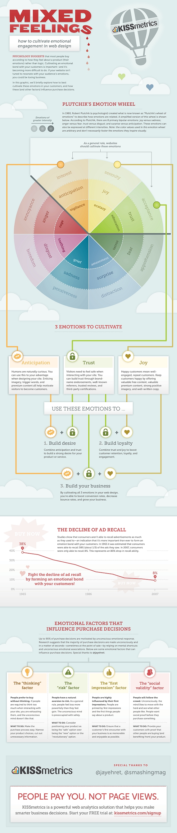
Source: Mixed Feelings – How To Cultivate Emotional Engagement In Web Design
16.Closure and Delivery Expectation
Ever signed up or bought something online only to be given a generic message or worse redirected to the homepage leaving you wondering if the process is completed? It is a very impersonal, ambiguous and leaves one hanging in a manner of speaking.
If you sign up for email lists, an ebook or a download of some sort then it is not uncommon to come across a screen like the one below.

While this is the default message that email marketing companies often provide, the person who signed now has to go about confirming the email address via an email that gets sent and perhaps going through one or two more steps in the process before actually being able to acquire what they wanted in the first place. I have provided more information on how to turn this problem into an opportunity by building a connection page.
So build a process that gives closure and provides the resources or products that people sign up for in order to match their expectations.
So there you have 16 research backed web design secrets to get you started with building a website that customers love to keep coming back to and that increases sales and sign ups. This list is however is not a complete list to optimize your website.
So in the comments below let me know what conversion related modifications or design related modifications have helped build a better website that your customers love.
Oh, and if you would like more of these sorts of web design secrets and persuasive triggers then sign up for the newsletter – it’s free.

Point number 2 is so important. Applying the KISS principle in web design is the best way to avoid clutter and guarantee a simple design to navigate from an end user experience.
true that – money are in the list so u should care of it